Brand Identity Materials
Identity Design
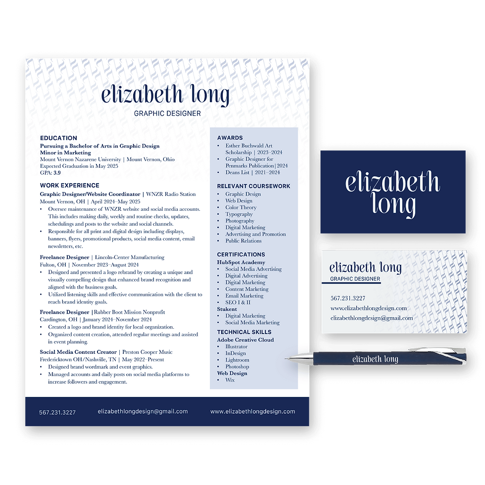
The "Elizabeth Long" brand identity and logo embody a perfect blend of elegance, sophistication, femininity, and maturity with an undercurrent of youthful enthusiasm. The logo, designed as a lowercase wordmark stacked vertically, is a refined and luxurious representation of the brand's values. The combination of thick and thin strokes introduces a sense of balance and class, while the tapered curves of the letters infuse the design with a modern, youthful energy. As a designer, my approach is rooted in bringing high-end quality to life in a way that is both approachable and attainable, ensuring that the brand resonates with mid-sized businesses seeking sophistication without compromising on value. The color palette, featuring a deep navy blue and a soft off-white, further reflects the brand’s luxurious yet approachable nature, aligning perfectly with the brand's mission to maintain a high-class aesthetic while offering affordability.